Font Selection
The goal of font selection is to ensure that there is a distinction between the application text and data text. Users will struggle to differentiate between titles, headers, sub-headers, and dynamic data without enough distinction. The fonts of the application should align with the brand of the system/product. For new designers, look at existing products to get a feel for what fonts are used for which brands.


font selection helvetica and montserrat
Font Size
Font size is used to create more or less obvious text. The larger the font, the more obvious the text will be. Larger font sizes should be used for headers and other text you want to call to the user's attention right away. You should think about the timing of the user's attention more than "what is important". If you want the user to see something right away, make it big.
Font Weight
Font weight is also used to create more or less obvious text. The heavier the font weight, the more obvious the text will be. Heavier font weights should be used for headers and other text you want to call to the user's attention right away.


font wieght
On this webpage, you can see Build Electric has a heavy font weight to call out the tagline right away.

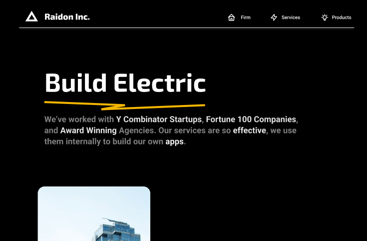
screenshot of raidon mainpage
Line Height + Letter Spacing
Line height is the distance between each line of text. Letter spacing is the distance between each character of text. As lines get further apart, the reader will read them a bit slower and it will be easier for them to consume. If they are too far apart it will be difficult to read. The same goes for letter spacing. If you can notice the letter spacing or line height, you've gone too far. These are subtle queues that help the reader know what type of information they are reading and how important it is to actually read it.
Icons
Icons are similar to fonts in that they are symbols humans recognize. This is why trying to use icons that are not easily recognized will work against your designs. If you are designing an Add Project button, you should use a simple plus icon (+). The more easily your icons map to that which they are trying to represent the better the user's experience will be. Hero Icons are very recognizable.