Alignment
When placing elements on a screen, users expect connection between these elements. In nature everything is connnected in some way. As humans we feel something is wrong if this connection doesn't exist in the systems we use. When placing elements you can either
Align Bottom


Align bottom
Align Top

Align Top
Align Left


Align left
Align Right

Align right
Align Horizontal Centers


align horizontal centers
Align Verticle Centers


align verticle centers
Below we can see these alignments in action on a Prohura screen. Notice the use of each alignment method, which connects elements visually.

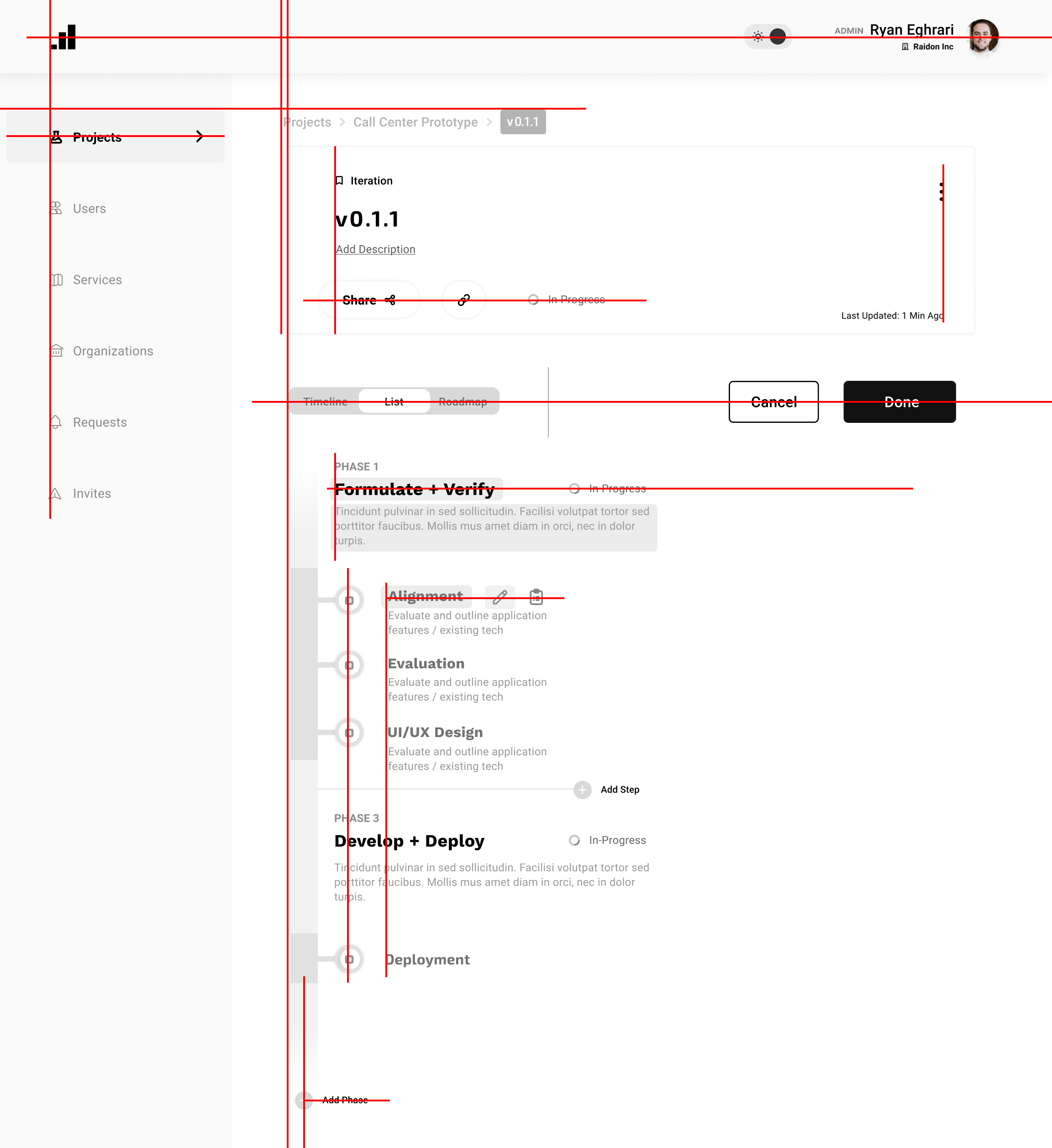
alignment of elements on screen
Spacing
The spacing of elements helps a user focus on some specific set of data. Data and user actions that will be accessed at the same time should be placed near eachother. For example in the following screen, you can see that the navigation is contained in the blue rectangle. Nearby are the breadcrumbs, which tell the user where they've been, in the bright green rectangle.
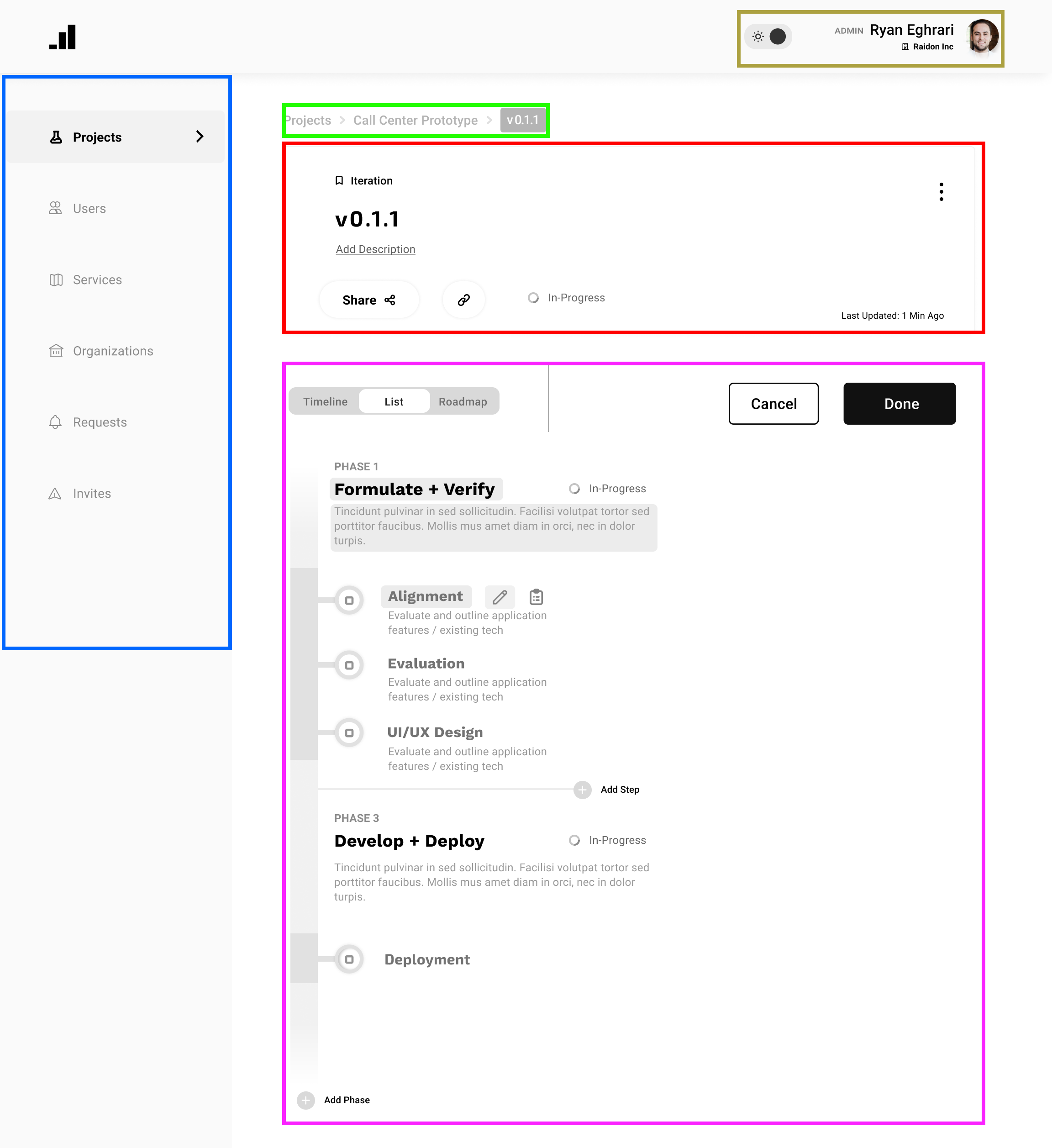
spacing of screen elements
Size
The larger an element the faster a user will see it. When building out screens you should think about which elements the user would want to see first and make those larger, more contrasted and in sight. For example after a user clicks edit, the will be shown two large buttons to cancel edit mode or finalize the changes.
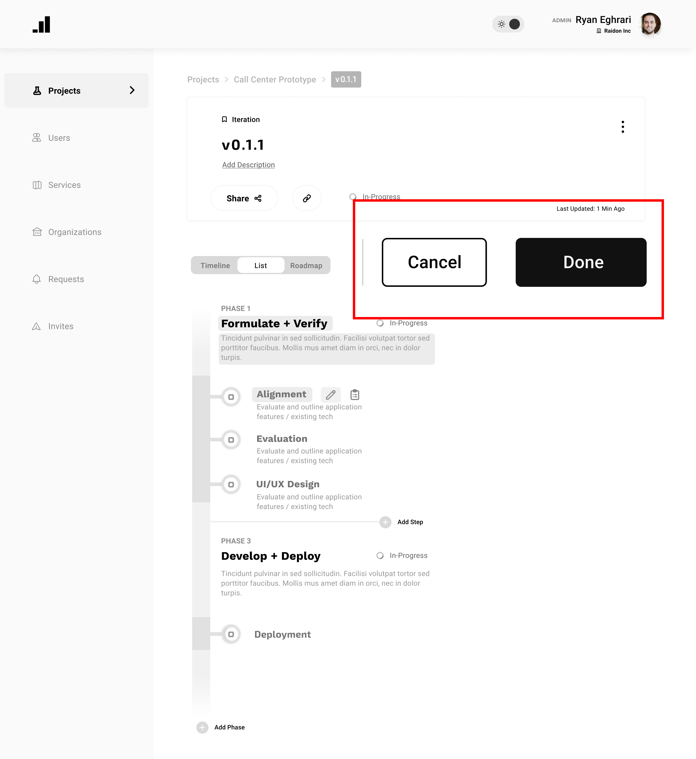
large button screen
While these buttons large enough to stand out, they are too large to look reasonably sized. They are oversized and break congruency of sizing of the other elements on screen. Instead sizing the buttons larger than most other elements but too large will ensure that they are quickly noticed by users without looking out of place.
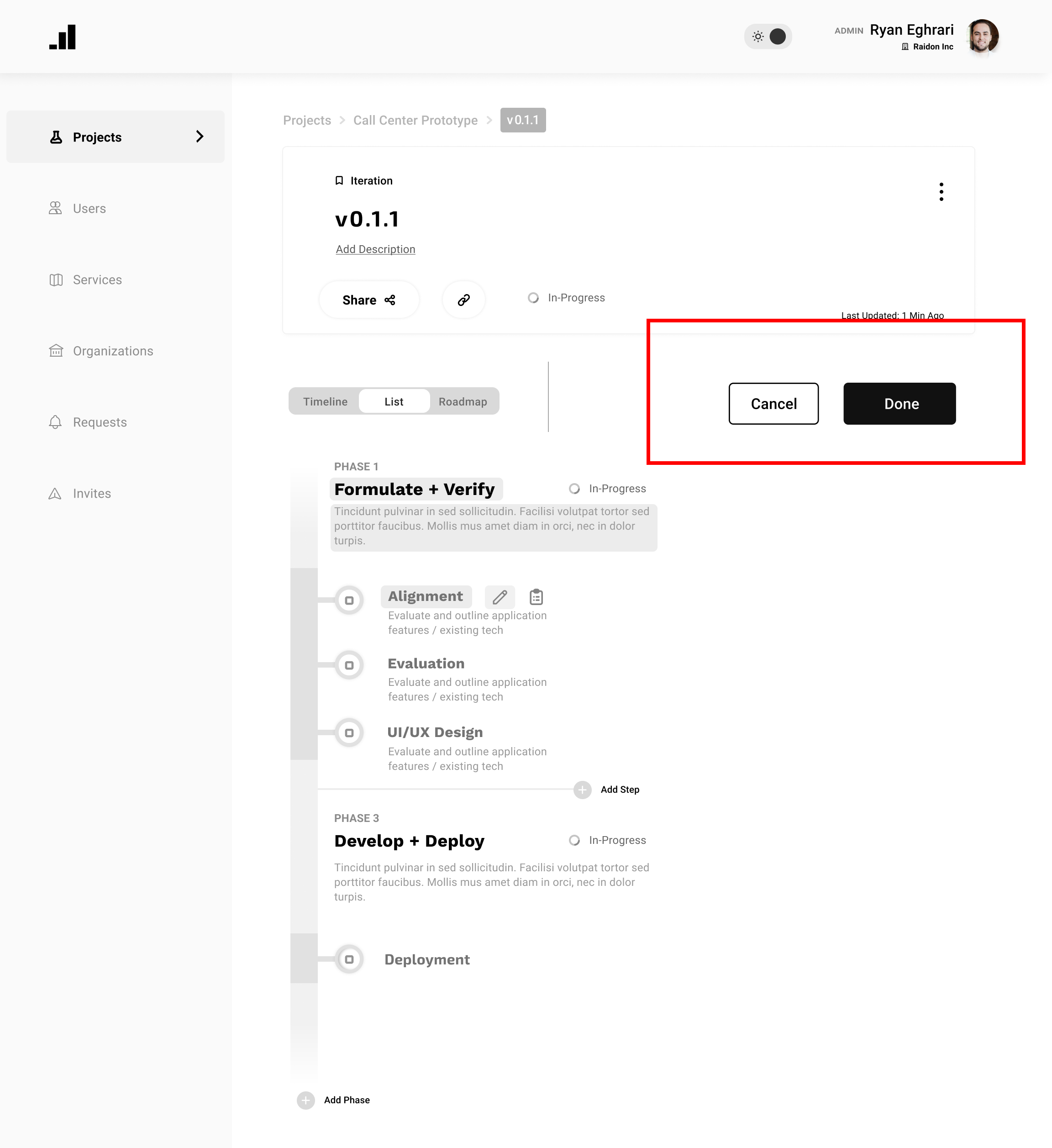
reasonable sized buttons on screen