The color in your application should serve some purpose. Randomly adding colors for no reason will cause your designs to become confusing.
How a Computer Knows Color
Your computer screen knows what color to show you because of a number that it reads from its memory. For each pixel on your screen, it has a different number that corresponds to some blend of red, blue, and green light. In a HEX code, following the # symbol, the first two characters refer to red, the next two refer to green and the last two refer to green. This is how engineers will take your designs and codify the colors you have chosen.


HEX values for red and blue
Color Interactions
Monochromatic
Monochromatic is the simplest of all color schemes, as each color of the palette is derived from the same hue.


Monochromatic
Complementary
Complementary colors are opposite colors with strong contrasting values.

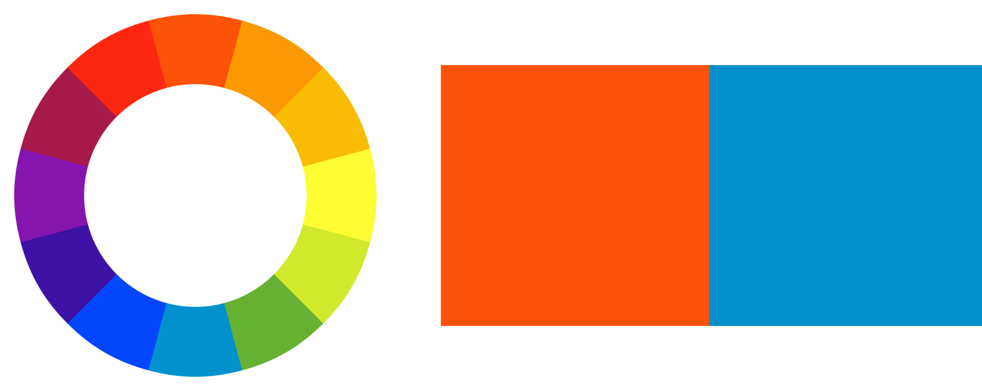
Complementary
Split-Complementary
A split complementary color scheme is one where one primary color is used with the two analogous colors.
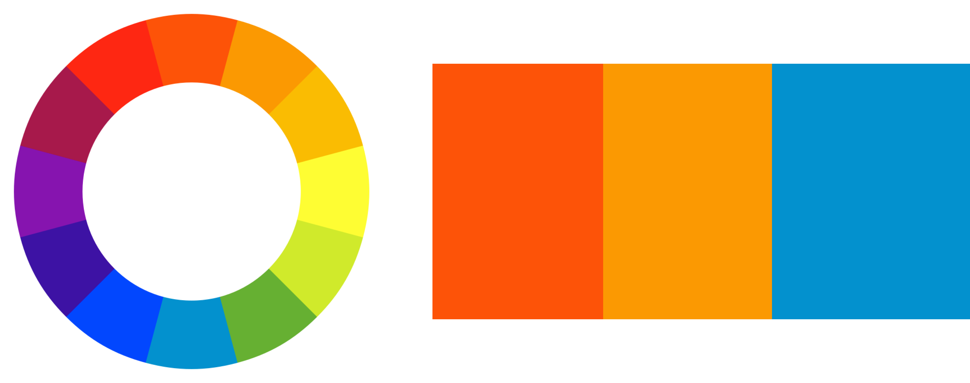
Split Complementary
Analogous
An analogous color palette is designed by picking colors with low contrast of the same vibrancy. (they look the same)
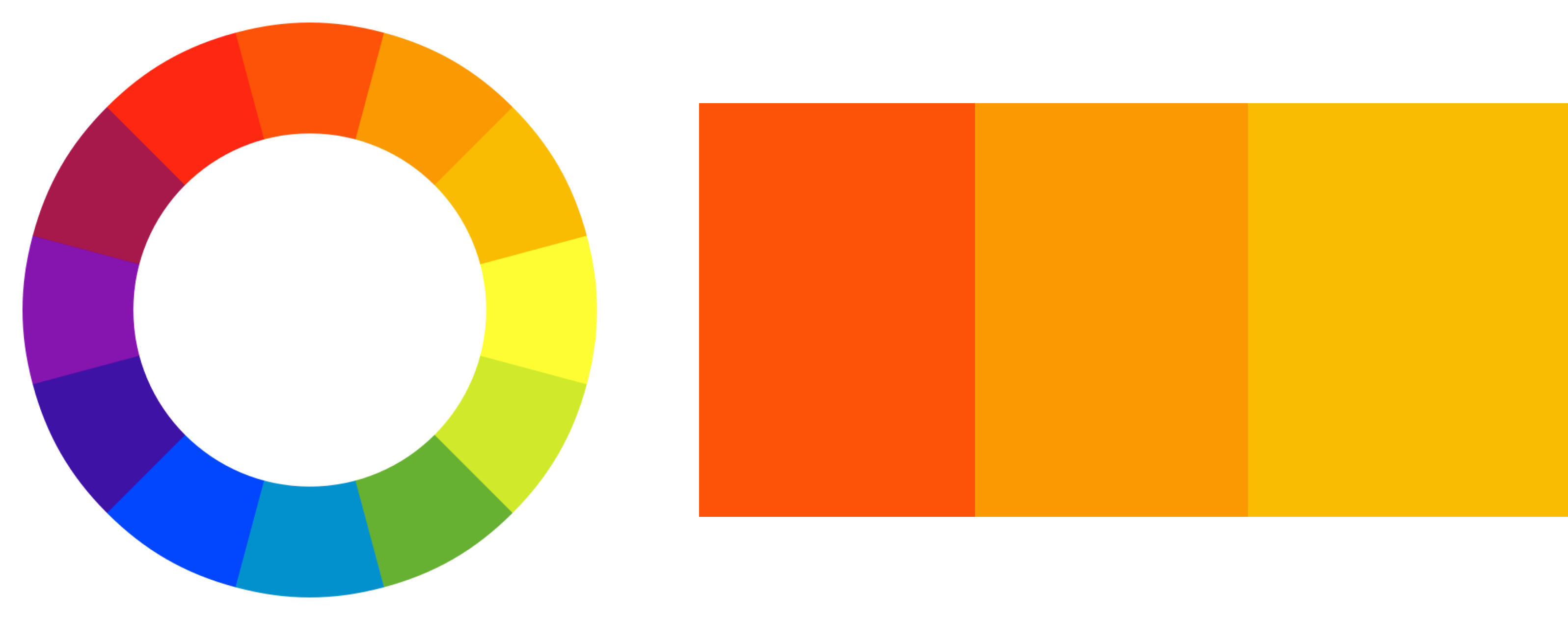
Analagous
Triadic
A triadic color scheme is designed with three colors that are equidistant from each other on the color wheel.
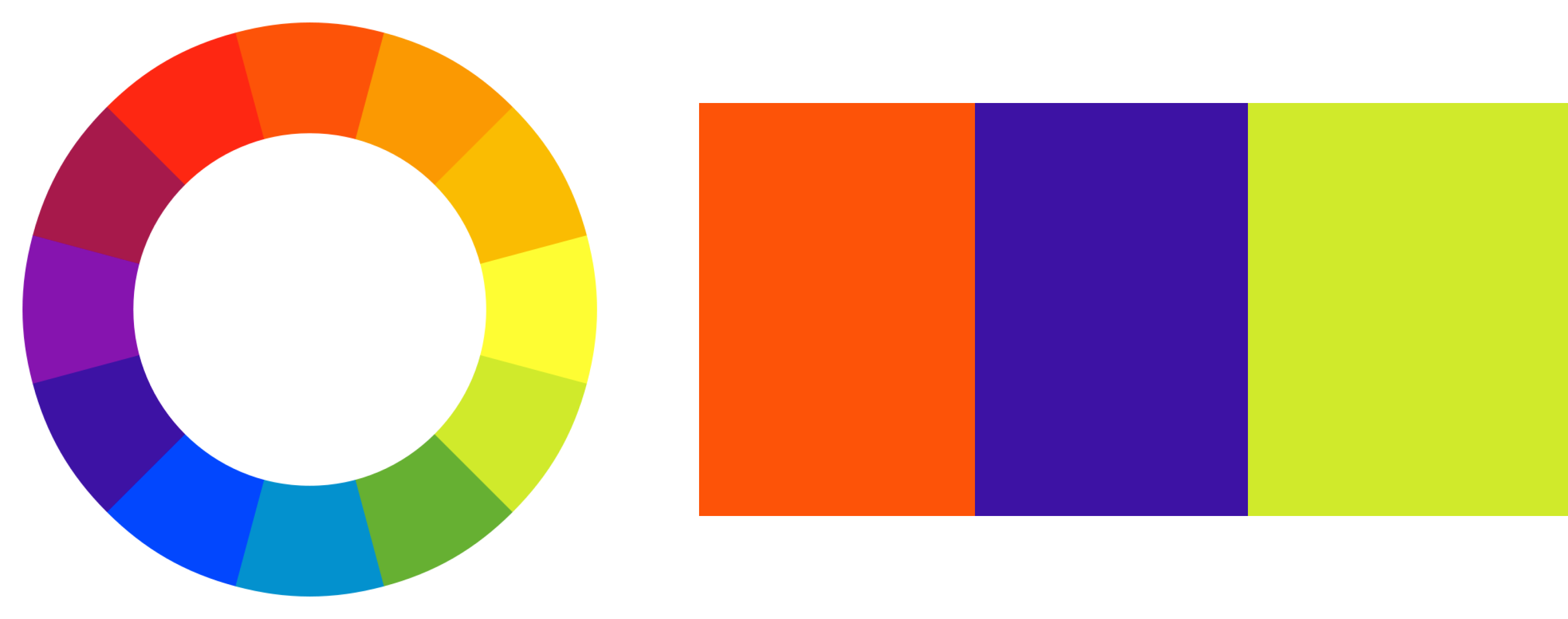
Triadic
Creating a color palette can also be done by taking a photo, and selecting colors from the photo using Digital Color Meter. You can try it out on these two colors:
HEX values for red and blue
You can also use color palette generators such as Coolors. A good color palette will align with the product's brand, be easy to consume, will help differentiate elements, as well as establish an element hierarchy.

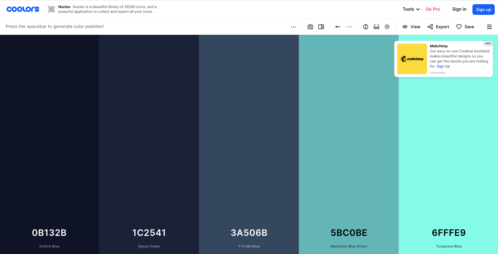
Color Palette Generator
An element hierarchy uses colors, sizing, positioning, iconography, typography, etc... to make certain elements more important, more visible, and more interactable than others. In doing so, you give the user a hint as to how to use the system efficiently. In the designs below you can see the use of the color purple to highlight the most common user action, to export the table data, or select rows in the table.

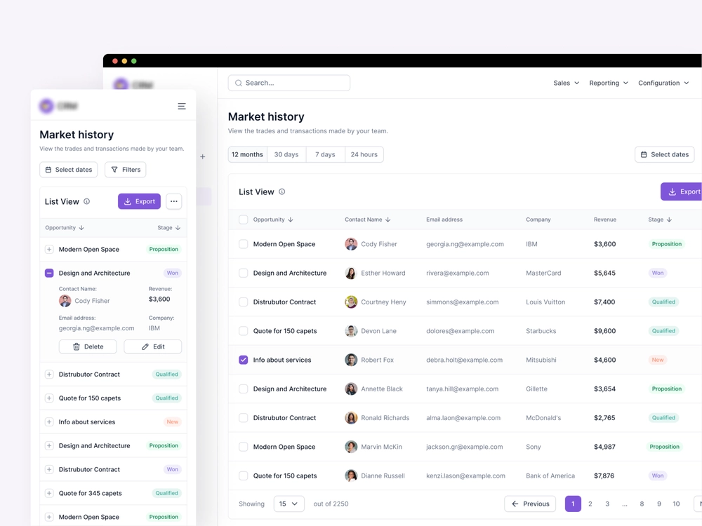
Purple Button Screen
Accessibility
Around 8% of men and 0.5% of women in the world are colorblind. How your elements appear on the page to the users with visual impairments will be largely dependent on your ability to avoid easily confused colors. Deuteranomaly is the most common type of red-green color blindness and it would make the above screen look like this:


Deuteranomaly converted screen
Deuteranomaly is the most common type of red-green color blindness.
Figma has a Color Blind Plugin that will let you select your designs and see them as if you were colorblind so that you can improve the accessibility of your design.